Windows 10 Maps
Revolutionizing online maps
Redesigned Windows Maps for mobile, tablet, desktop and beyond. Created advanced search capabilities for trip-planning scenarios, improved usability, and ergonomics.
Designed in 2015, it pioneered features that are now common, and others that still have no equal.
UX/UI
Design systems
NUI
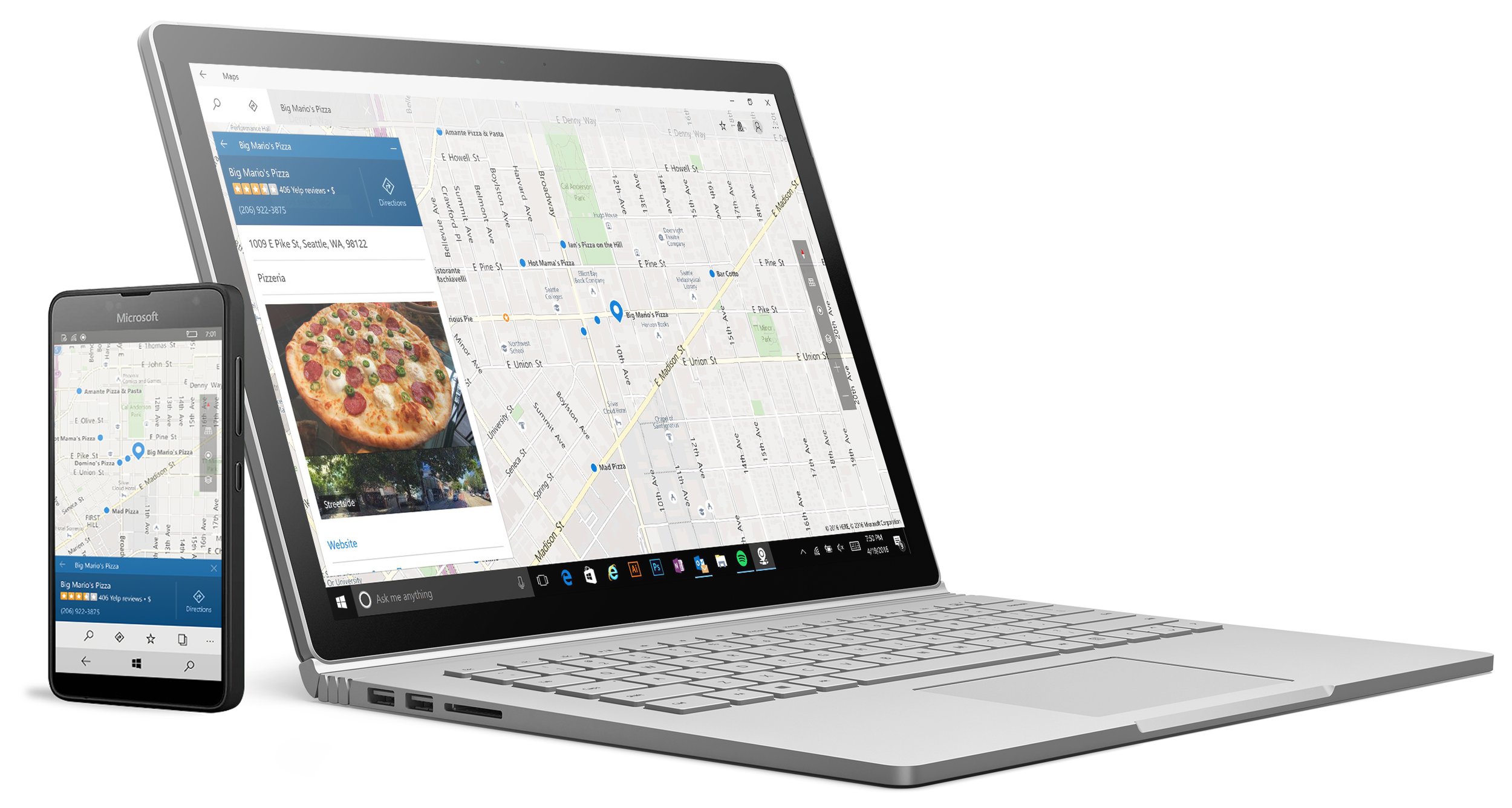
Learnings from previous design
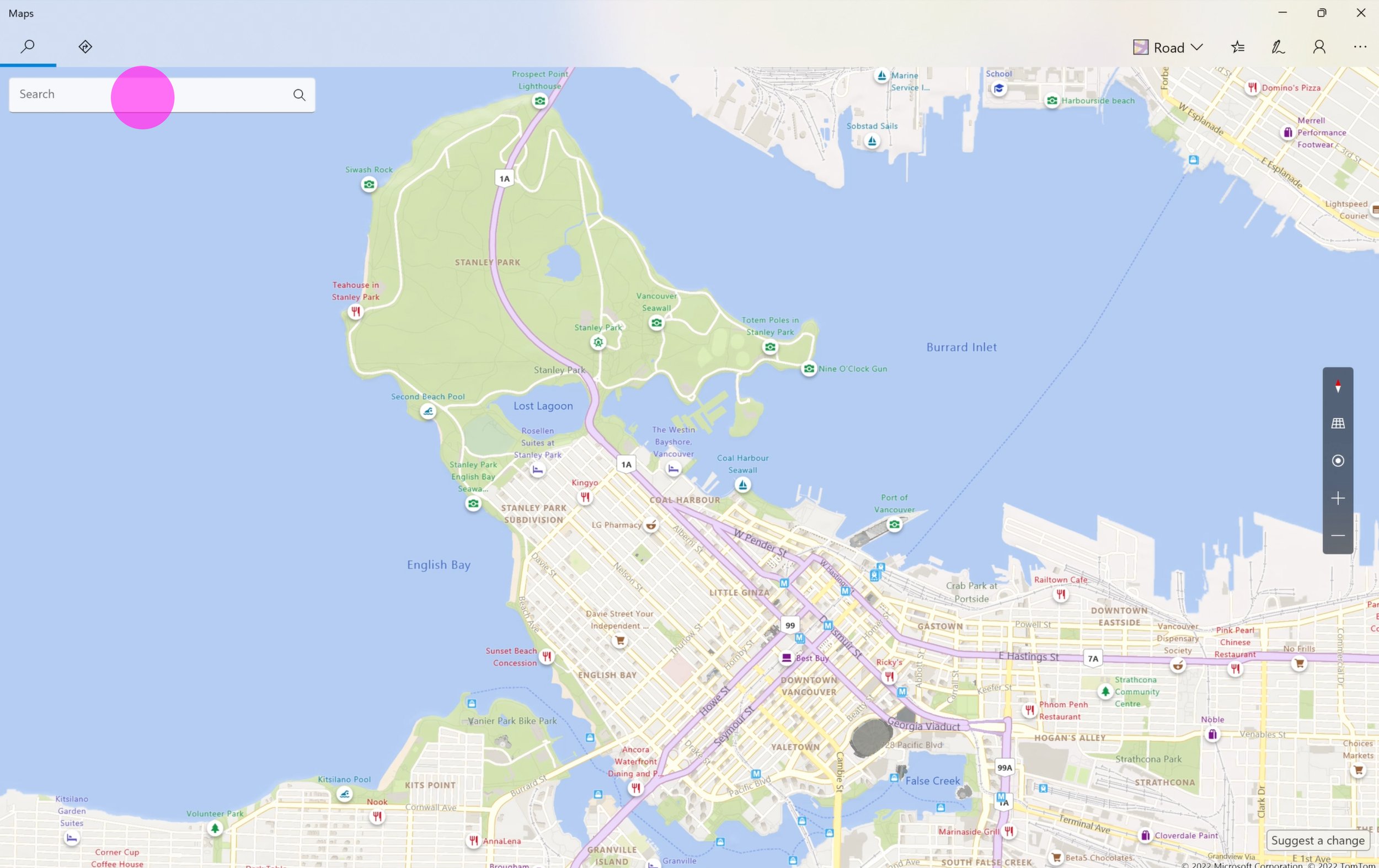
Celebrate the map, not the chrome
The first version of the app was chrome heavy, with a persistent left panel that occupied space regardless of how much content it contained.
Improve reachability on mobile
Navigation on the mobile app was hard to reach when holding a phone with one hand—important when on the go.
Explorations
Option 1
Searches build to the right, and cards pop up proximally
Option 2
Searches build vertically, in a persistent position, height relative to amount of content
Revised model
Based on early UR studies, I created a hybrid model where searches build to the right, and populate content in a persistent position—which tested well. We went on to experiment with mobile and tablet layouts.
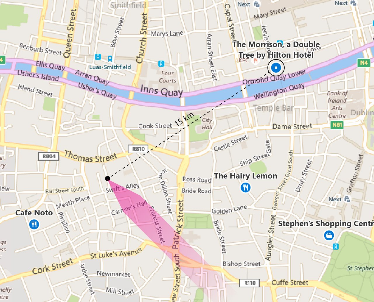
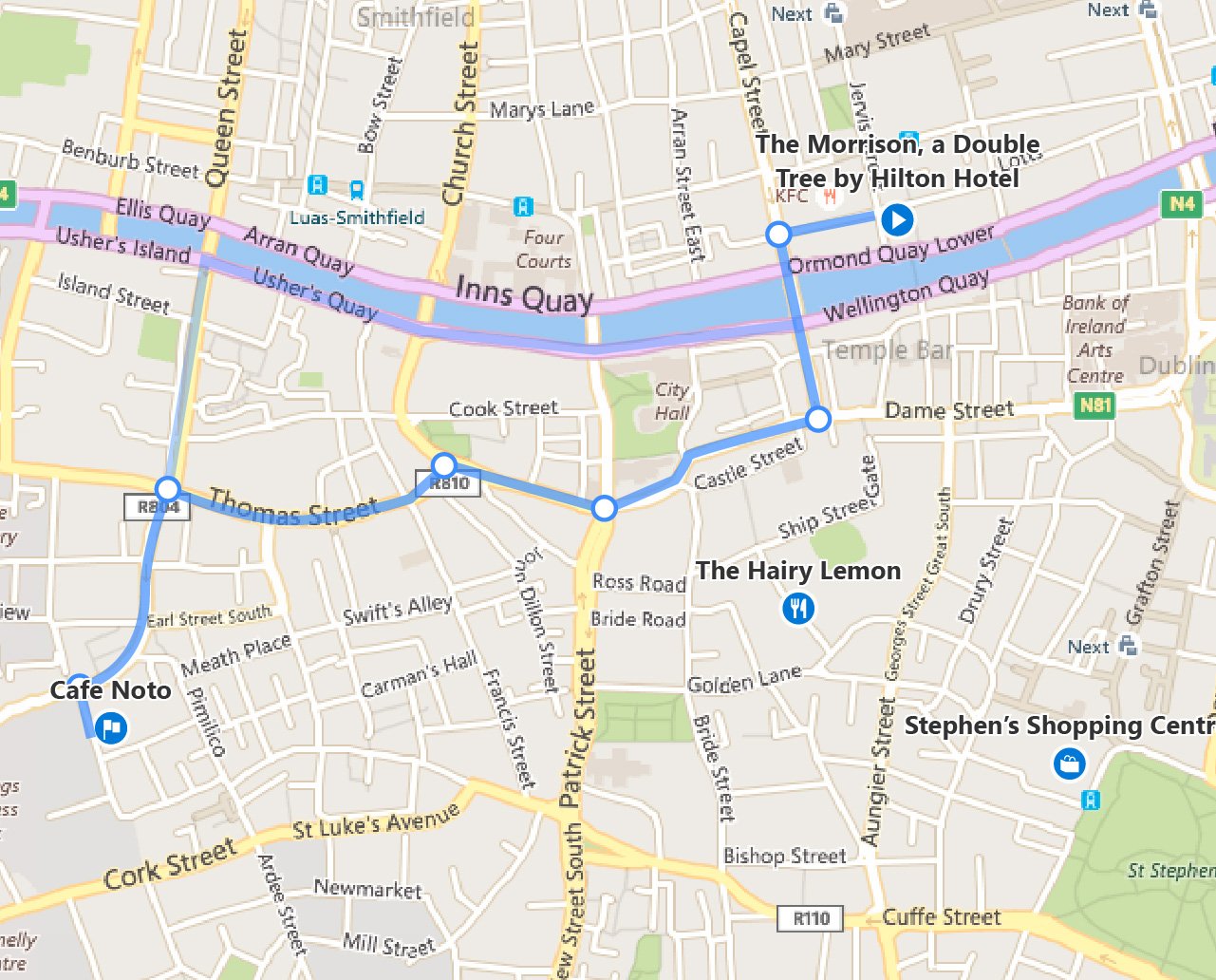
Inking
Early explorations for draw-for-directions and canvas annotations
Final designs
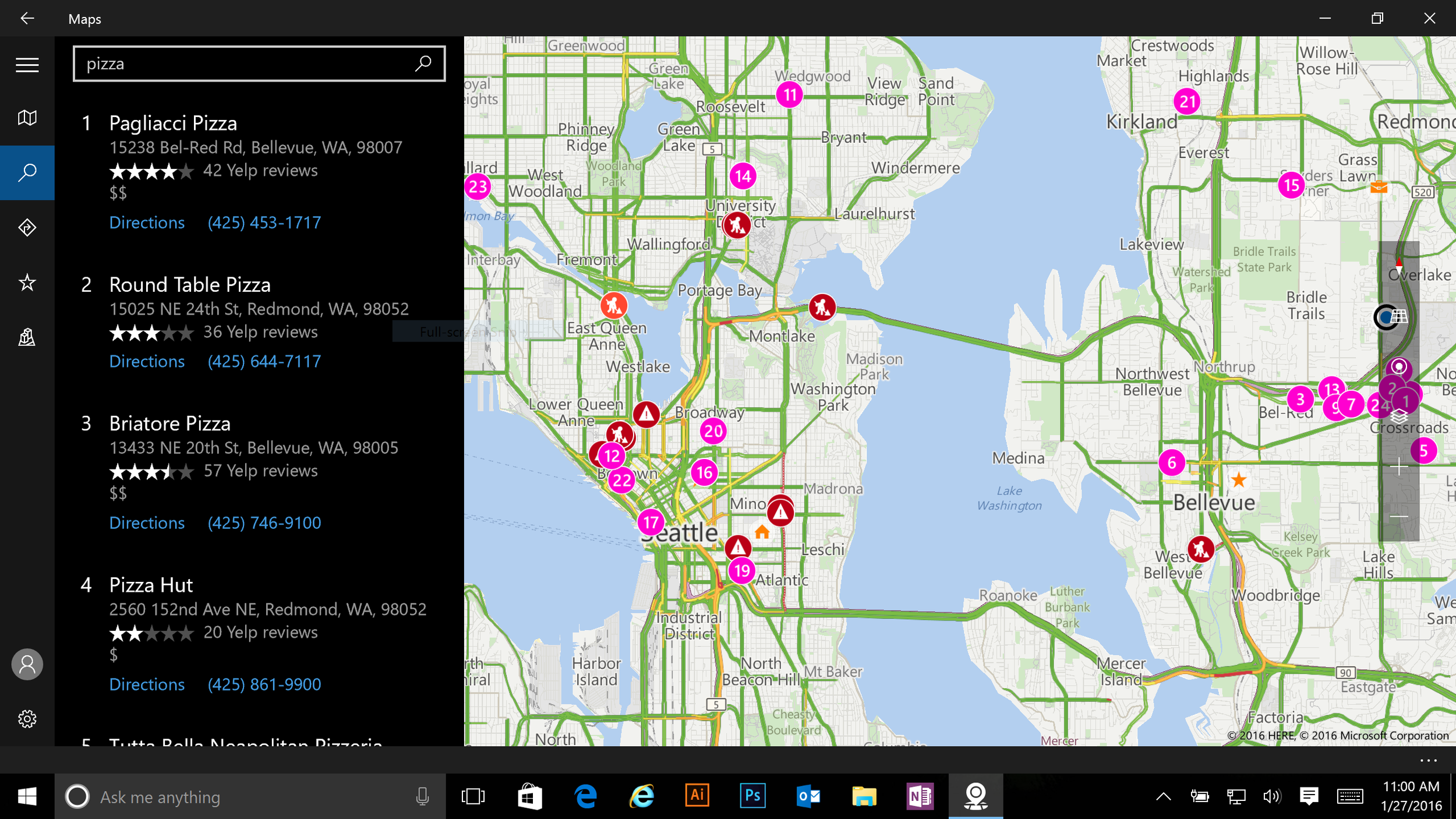
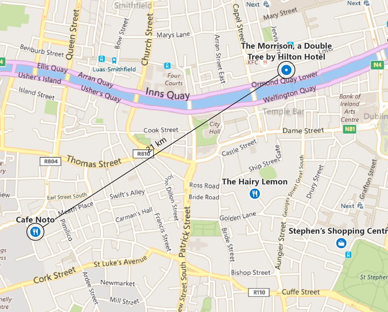
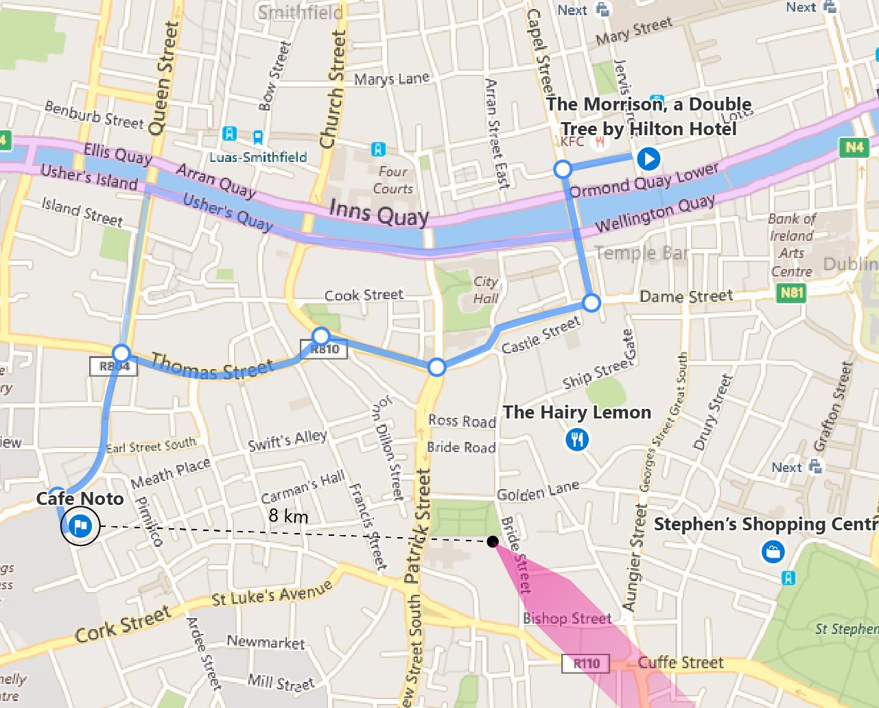
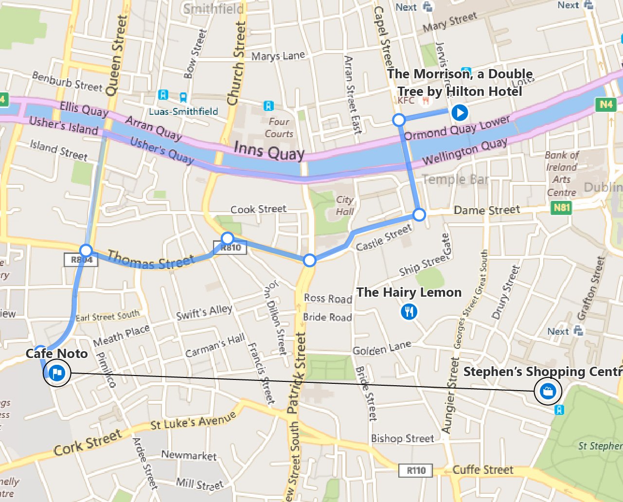
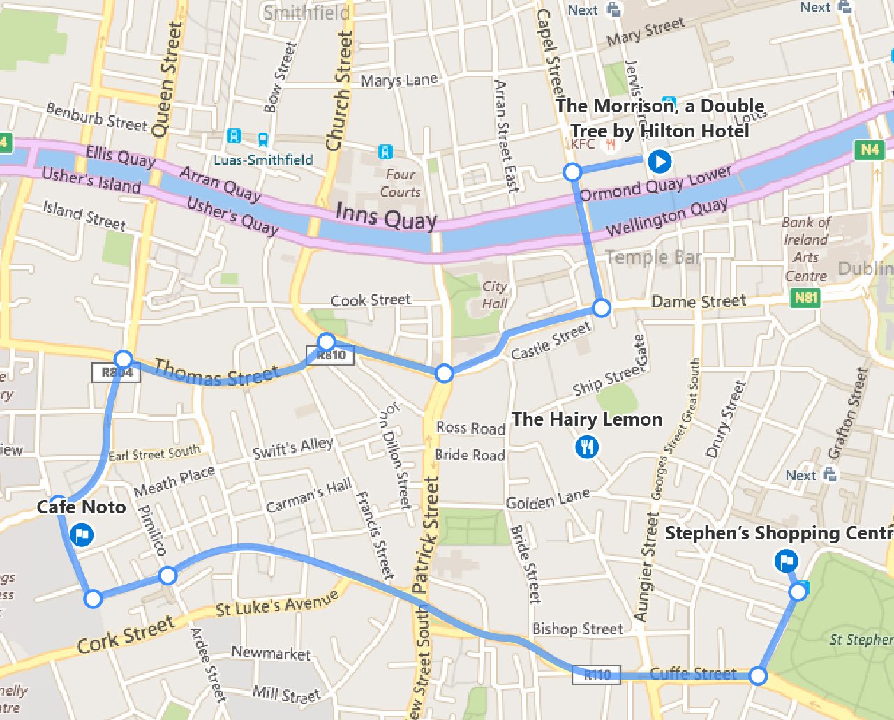
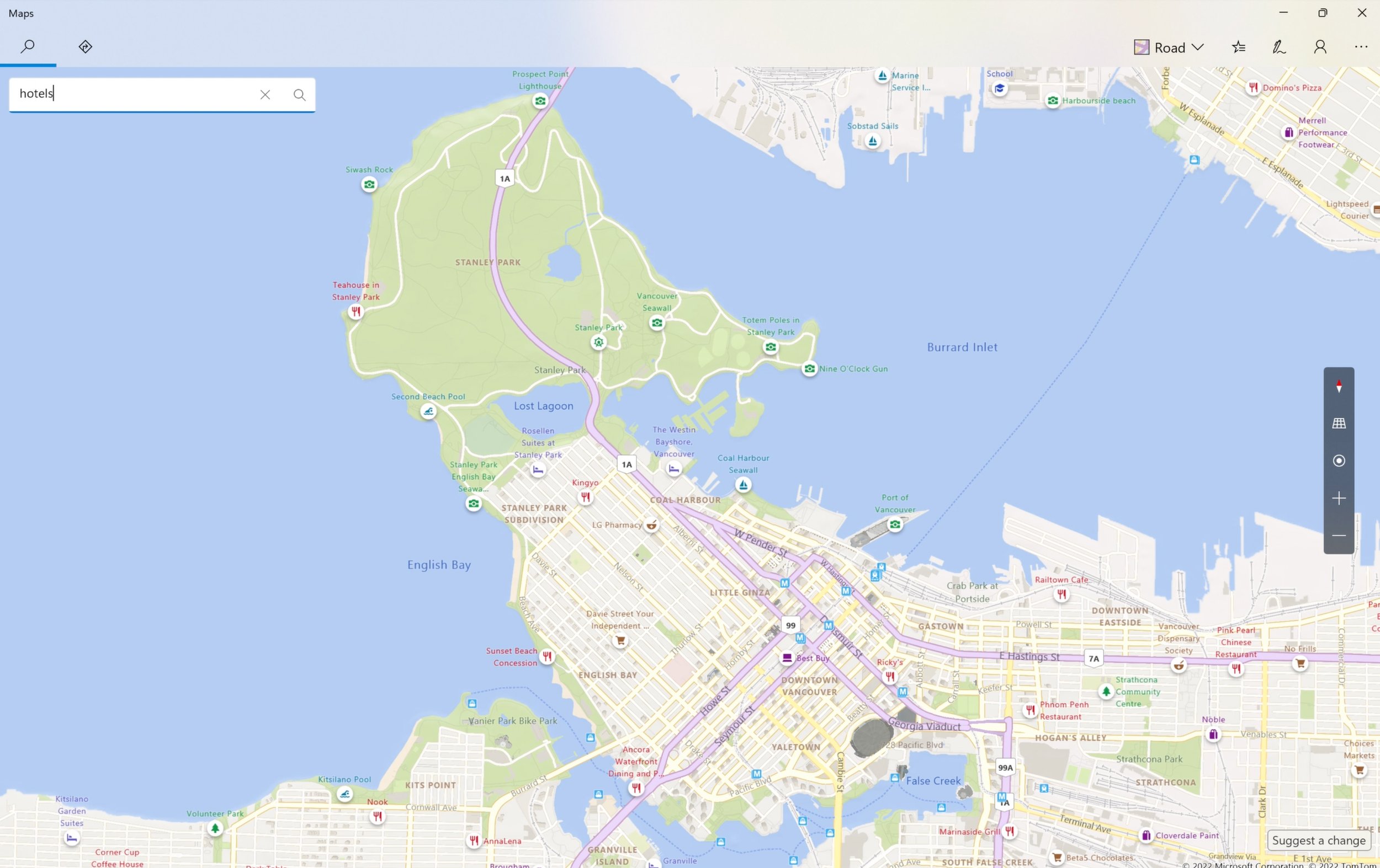
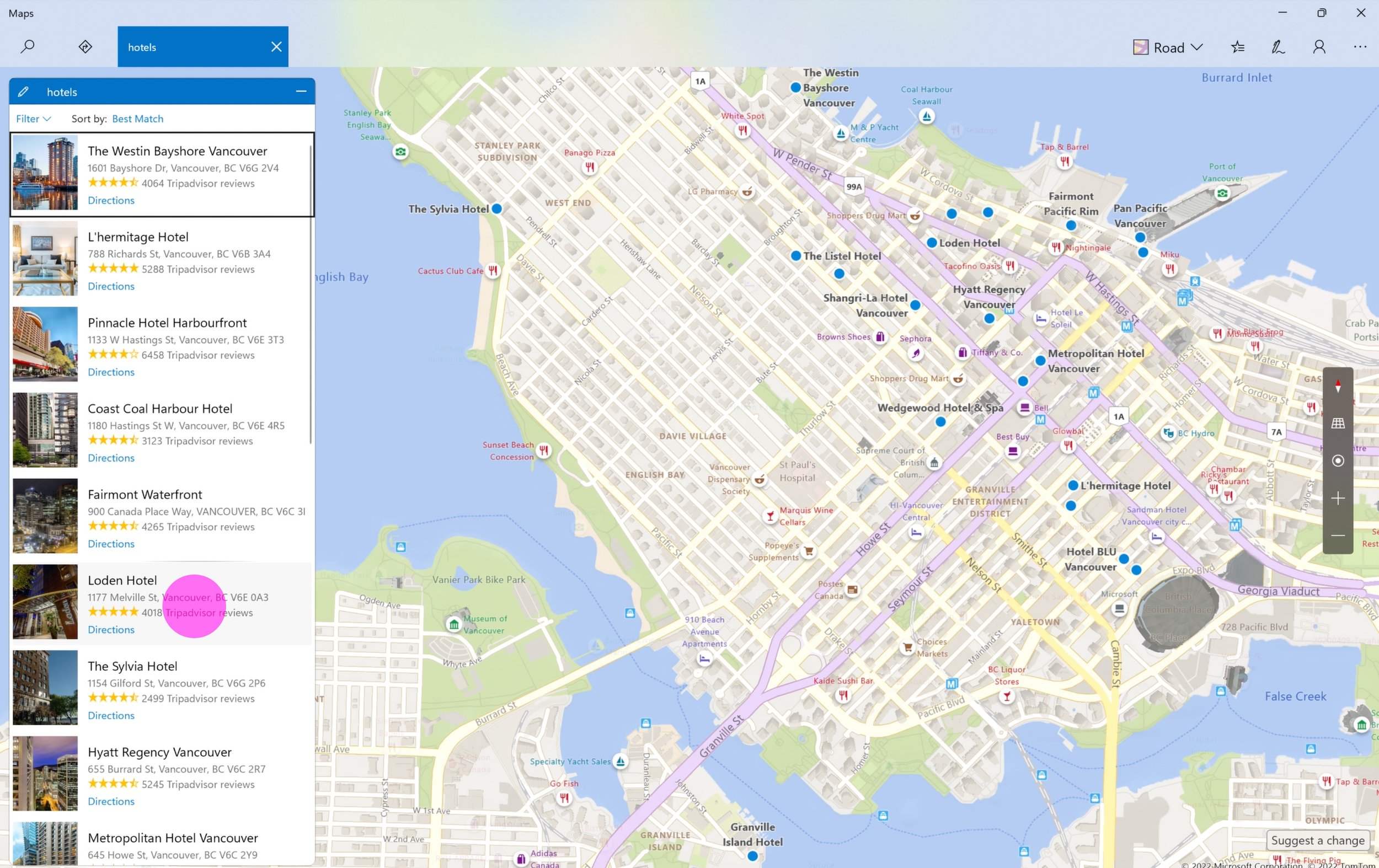
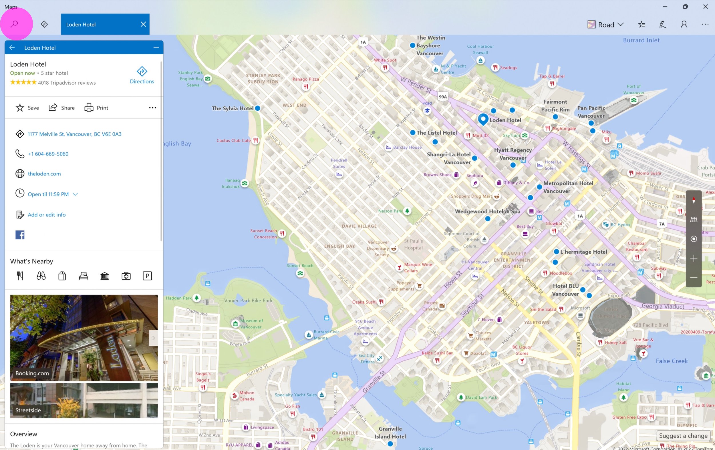
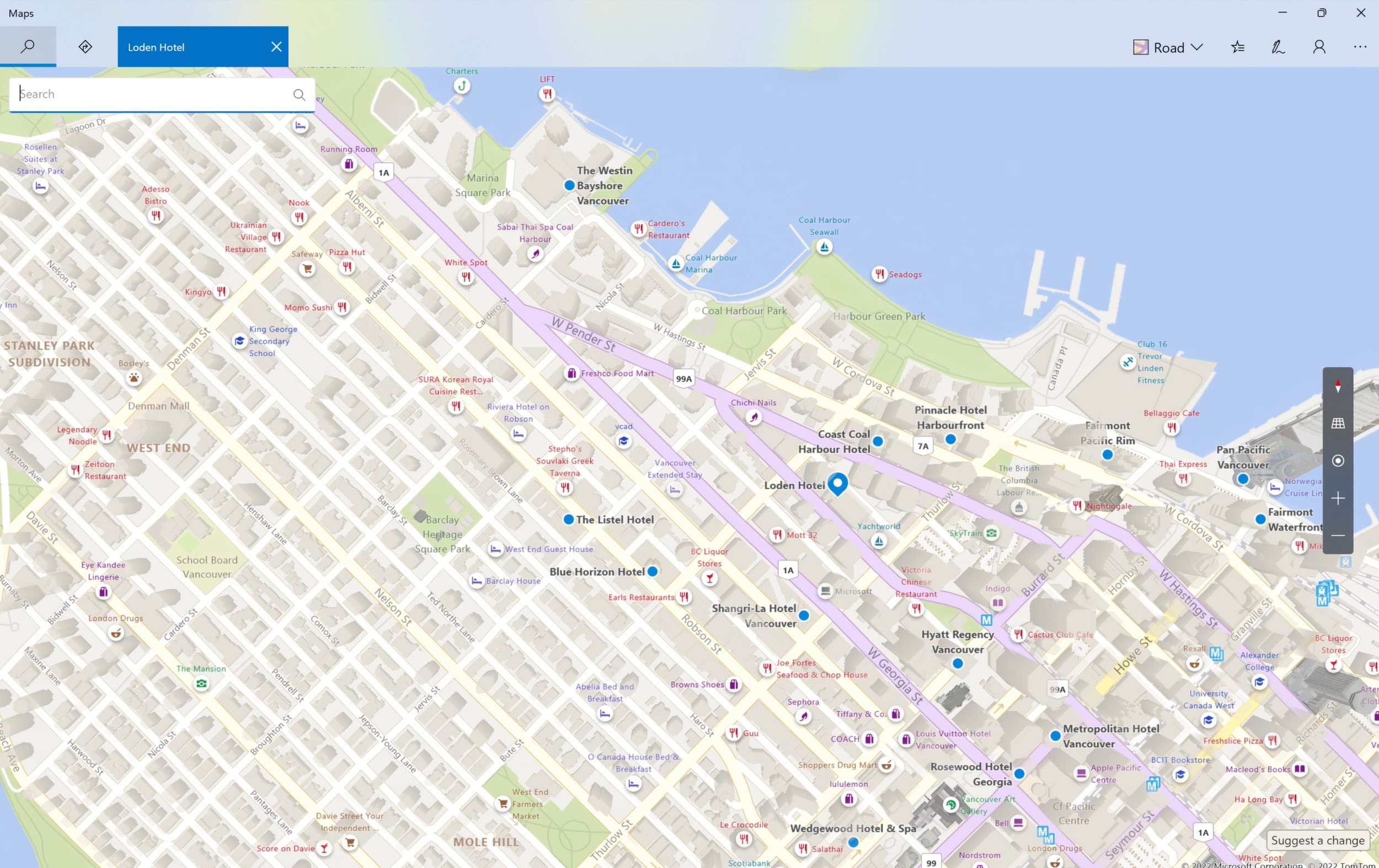
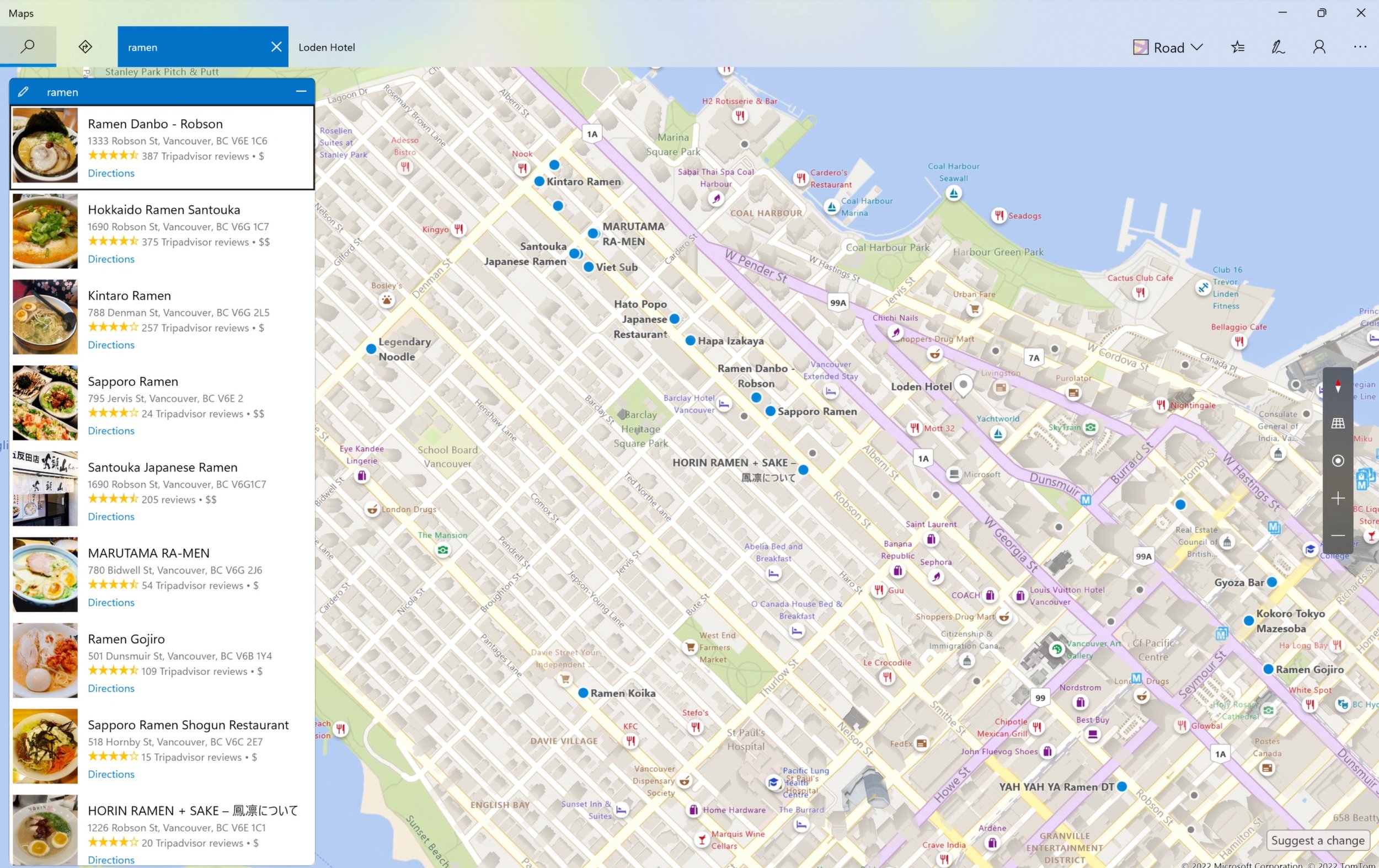
Multi-search
Trip planning scenario: search for hotels and find great ramen nearby
Improved reachability
Key navigation moved to the bottom, and flick/pull gestures allow for easier one-handed use.
Accent color
Active and inactive points of interest designed to support Windows accent colors, including neutral tones.
Theming
Full support for light and dark themes.
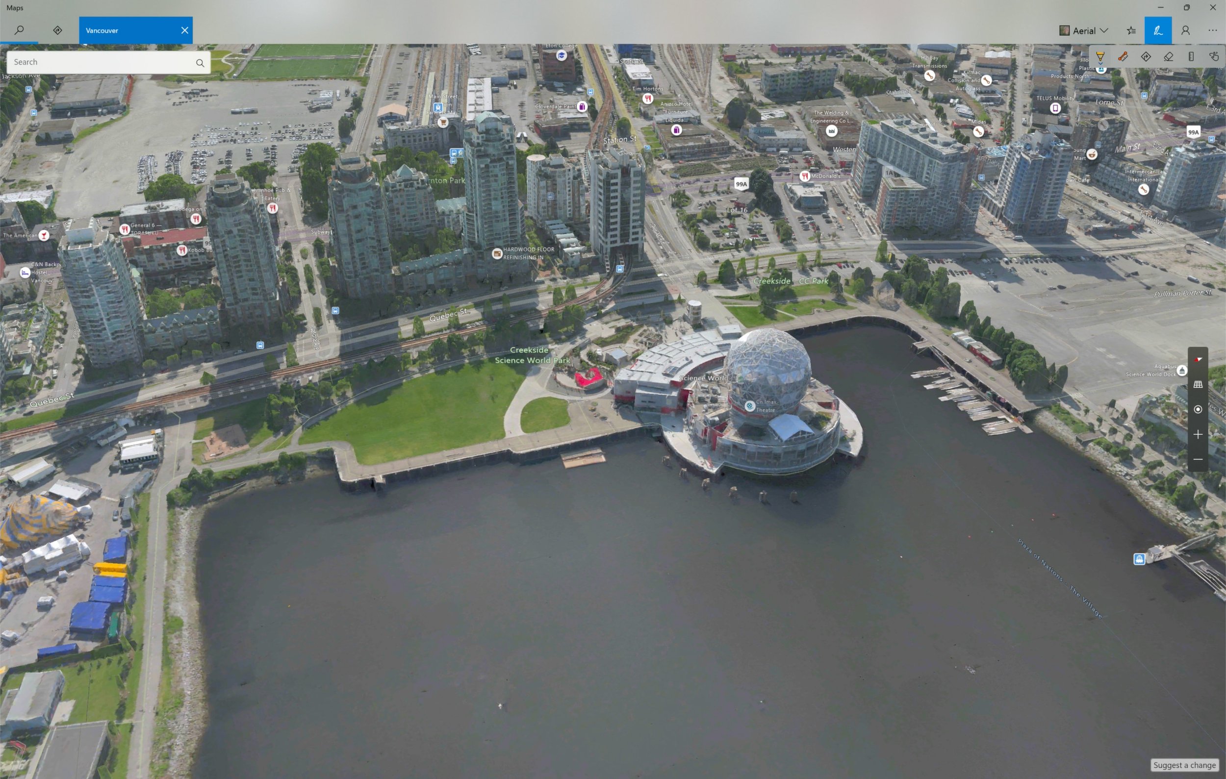
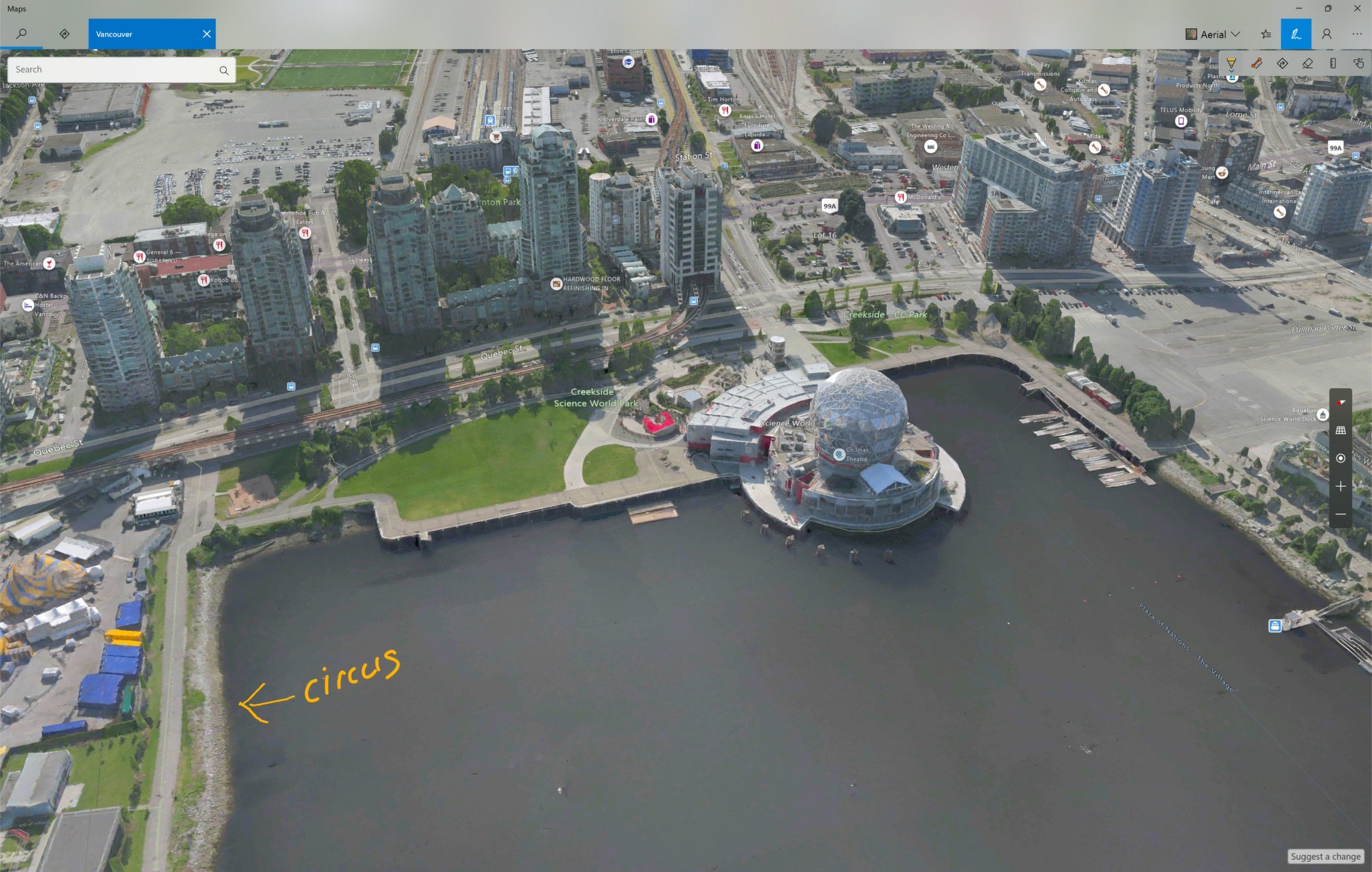
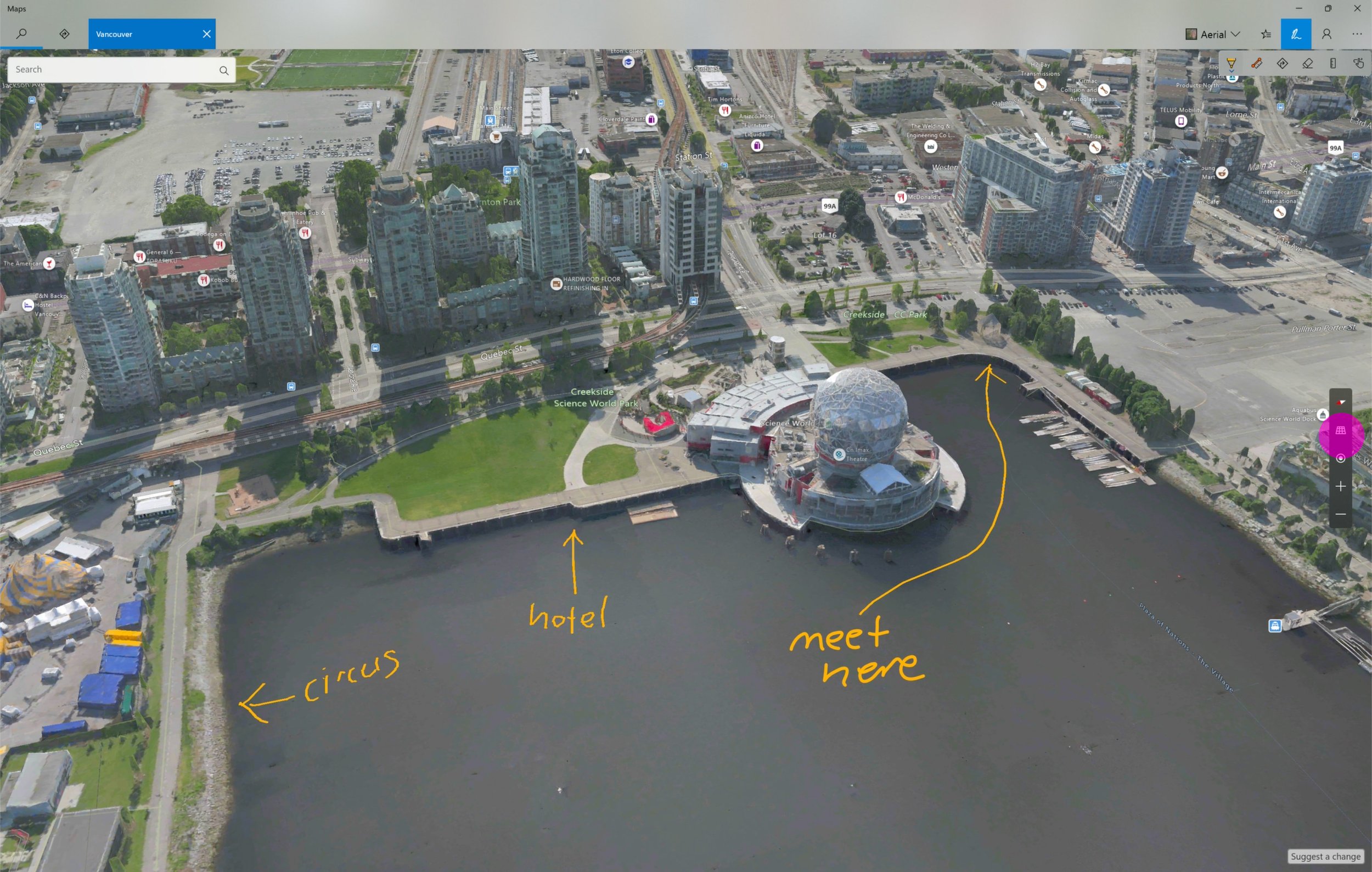
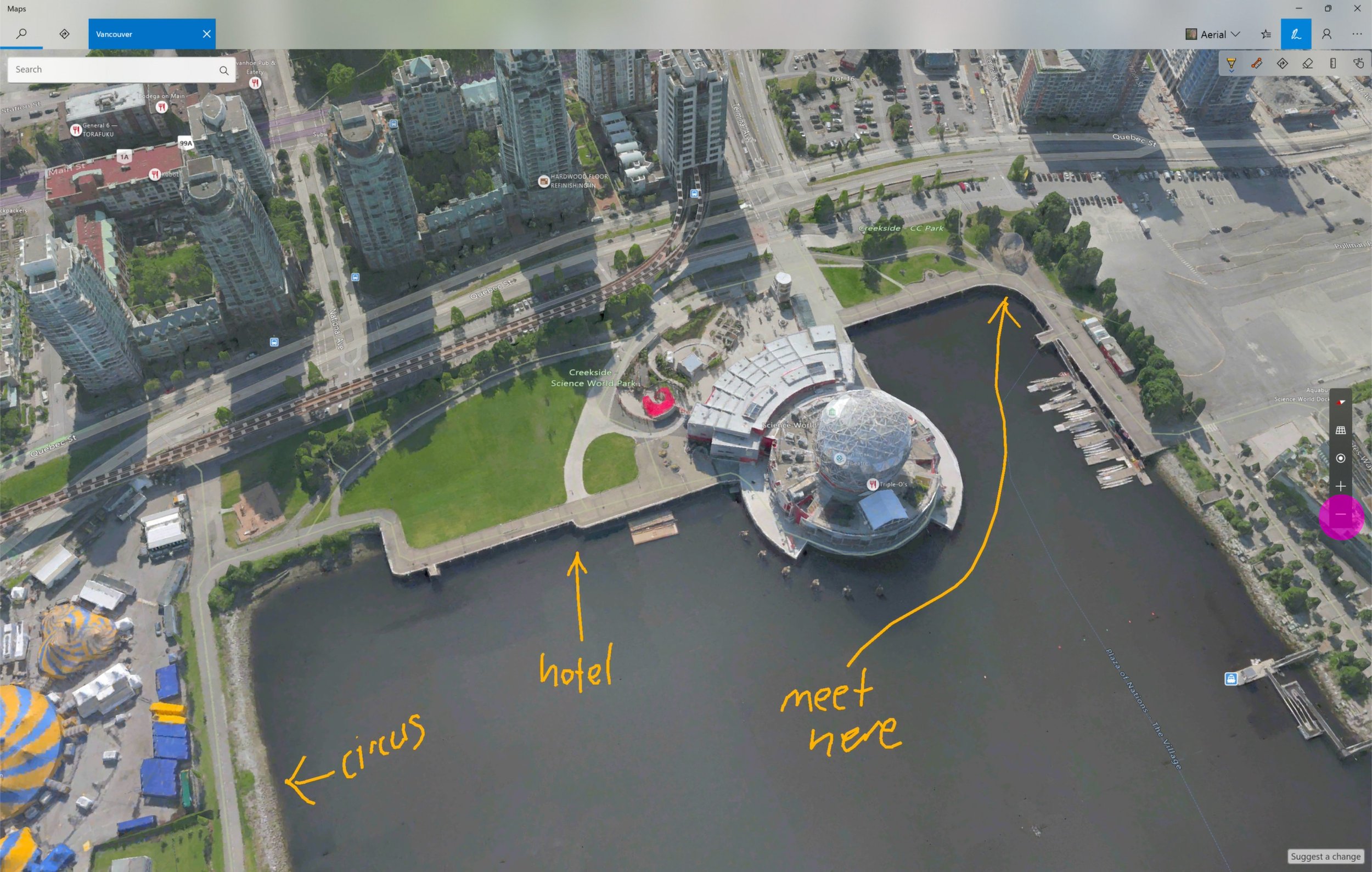
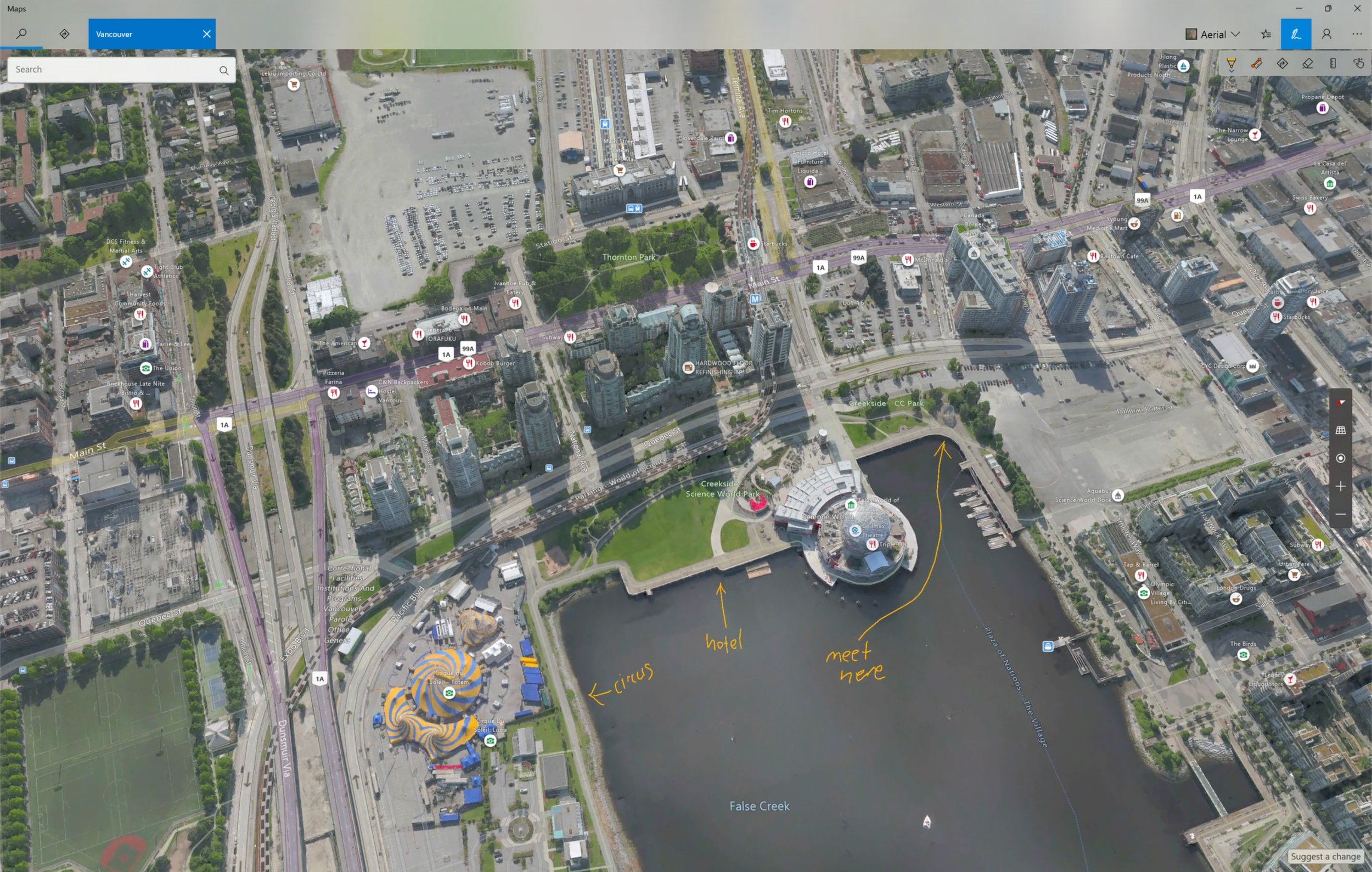
Map annotation + 3D cities
Annotation persists on map canvas
